UX Research
AppGuard Management System
AppGuard is centrally managed, anti-malware protection designed to insulate a company or organization from computer risks.
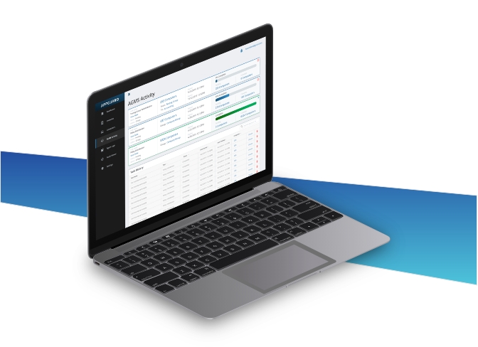
The administrator of the system uses a desktop web application known as AppGuard Management System (AGMS) to manage the security policies on computers in their organization.
The client requested a UX Analysis with a modern interface redesign of the current product. My role was to work with C-suite stakeholders, lead the UI design effort, and guide developers to create the final product.
This project is split into two parts—UX Design, and UI Design. To view the UI Design process (Part 2), please click here.

Interviews
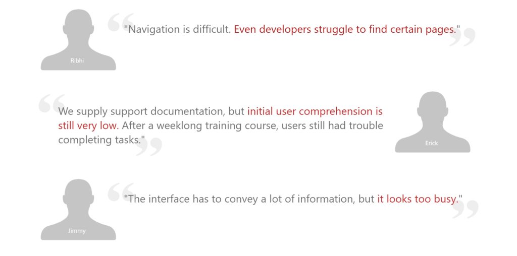
My first step was to interview with various stakeholders to develop an understanding of the product and it’s users.
The feedback and information I gathered during this phase served as a reference for further research.
Navigation diagrams
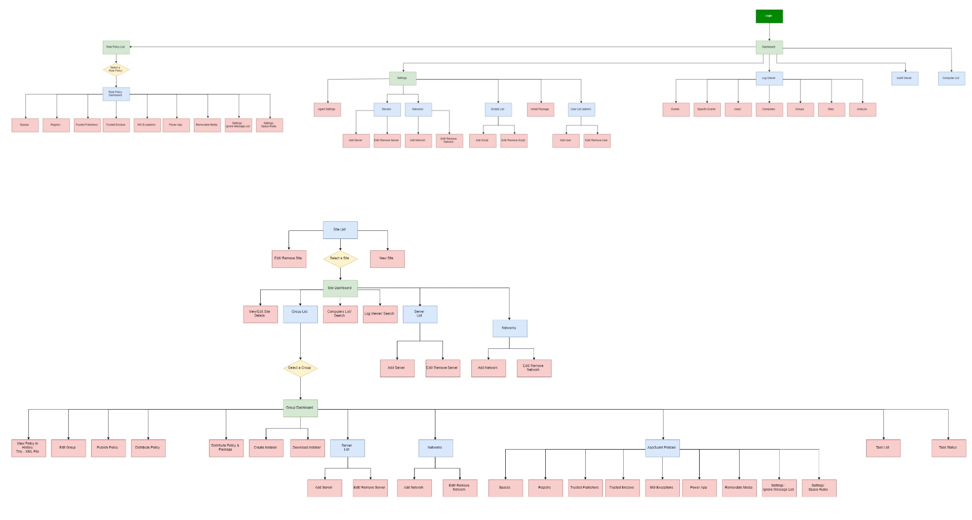
Navigation diagrams were created to show the organization and information architecture of the AGMS system. This helped to identify all possible tasks, screens, and provide a reference for interface changes.
Heuristic analysis
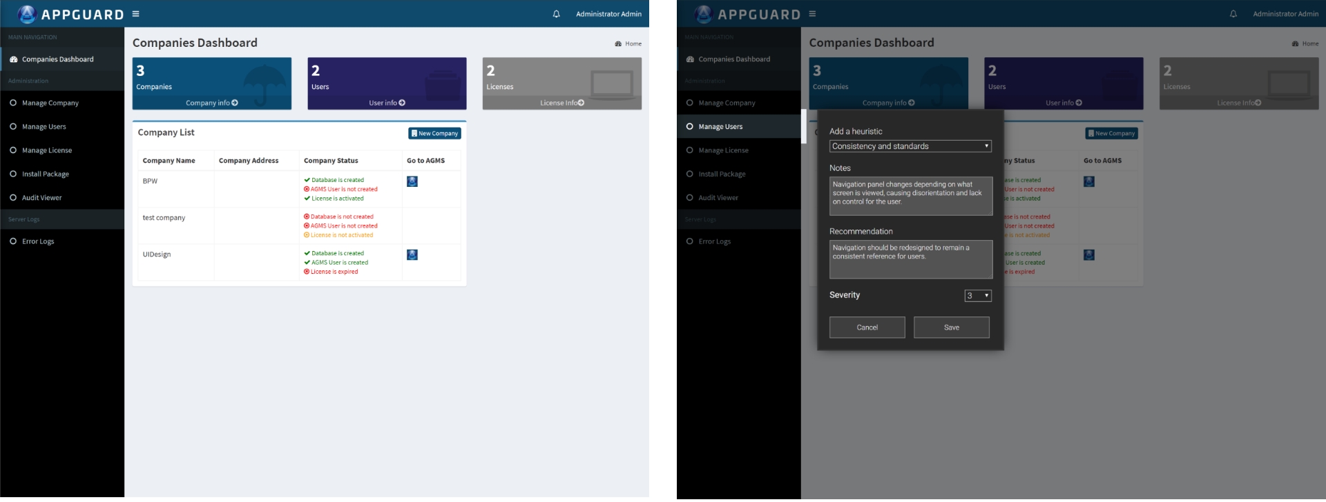
An analysis was performed by scrutinizing each screen to find surface level UX improvements. Annotations were created and detailed to record improvements based on UX heuristics, and to illuminate solutions for minor usability issues.
As tested interface
Adding an annotation
User testing
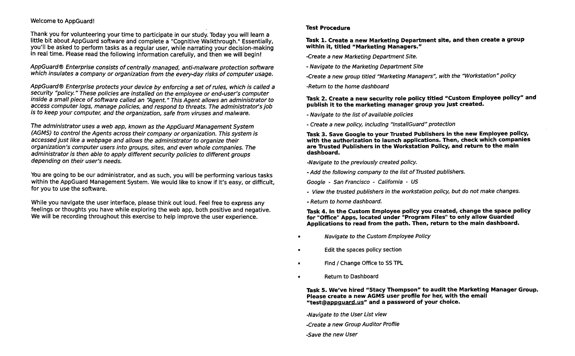
Multiple user tests were performed and monitored to identify actual behavior patterns, and collect metrics to support design decisions. By providing a script and standardized test procedure, I was able to ensure a consistent comparison between test participants.
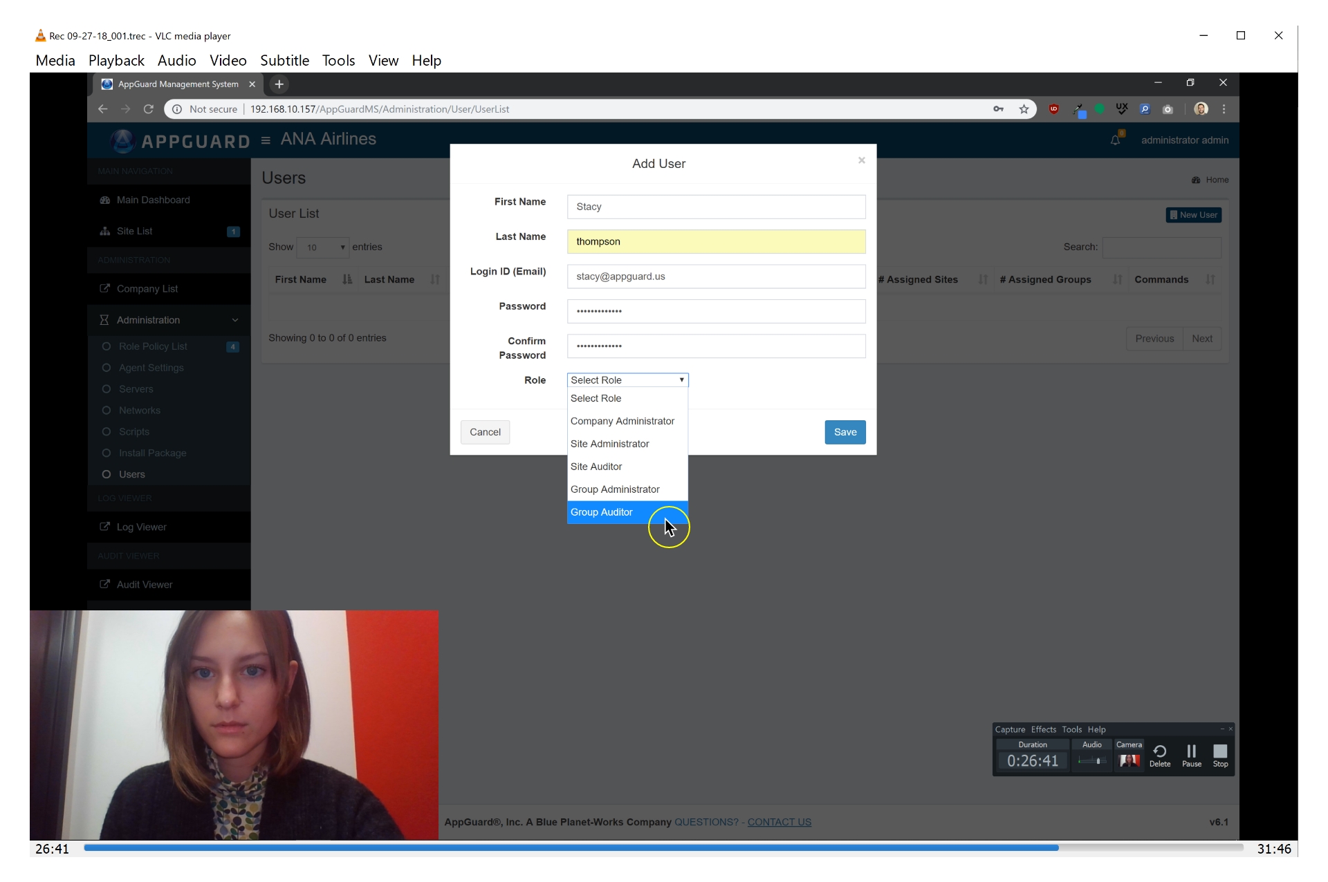
Video recording sessions proved valuable when observing user behavior patterns and to identify frustrations, discoveries, and confusion.
Testing results
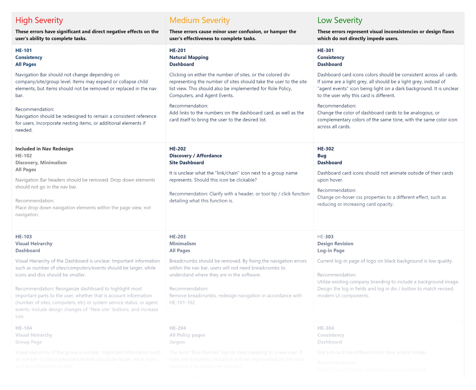
From initial research, there were 72 opportunities found for improvement. Once identified, I categorized each issue into High Severity, Medium Severity, and Low Severity to aid stakeholders in prioritizing development.
Initial design improvements
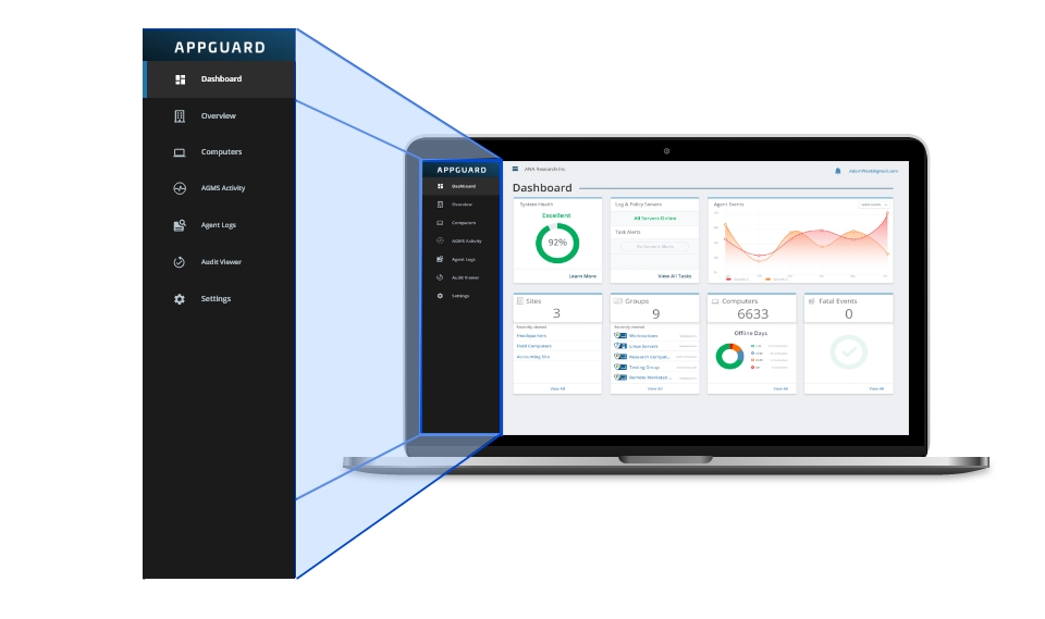
Consistent Navigation
Design a navigation panel with consistent options, no matter which page the user is viewing.
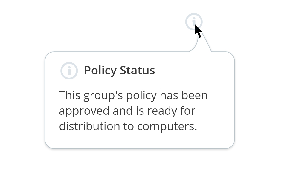
Contextual Information
Show tooltips or provide descriptions regularly when users are expected to remember complex terms, or make decisions.
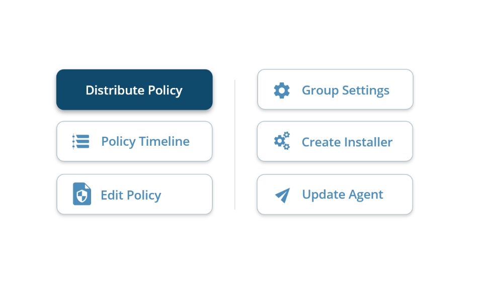
Utilize Visual Hierarchy
Use interface layouts that emphasise more commonly used elements and minimize or hide less important elements.
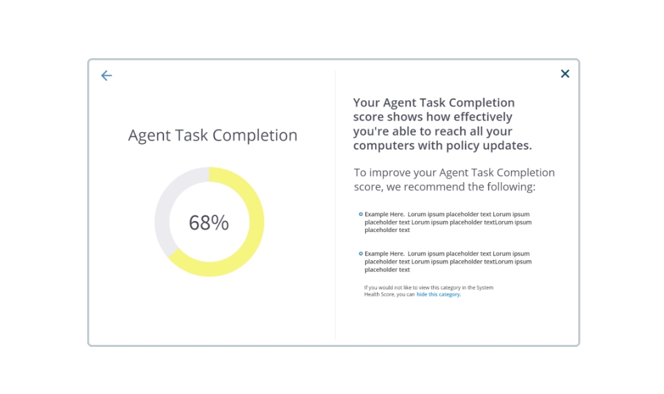
Understandable Terminology
Use clear language to explain AppGuard concepts as much as possible.
Design management
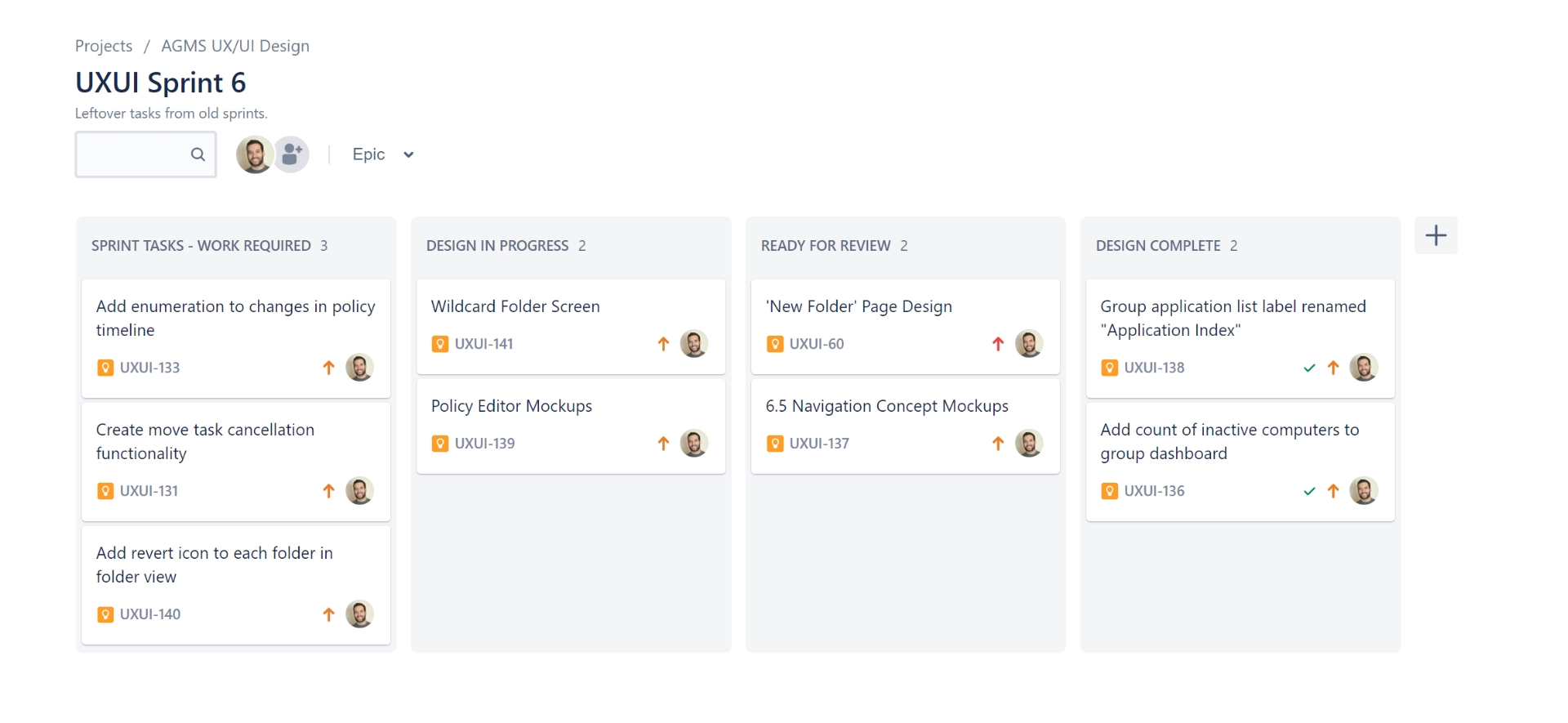
Using Jira, I created design tasks, managed a schedule, and planned workloads while collaborating with developers in a fast paced agile environment.
